Redesigning the Casino platform backoffice
How we transformed a complex analytics platform into an intuitive, user-friendly experience that increased user engagement by 40%.
Key Results
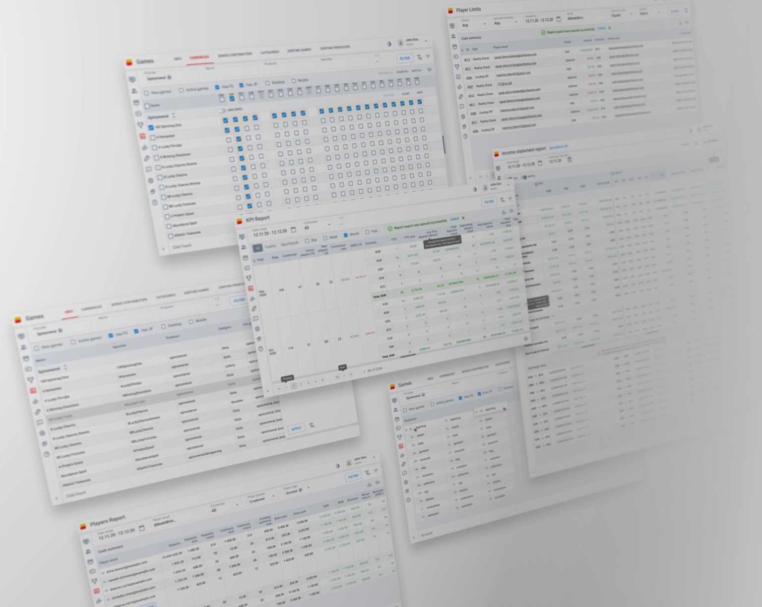
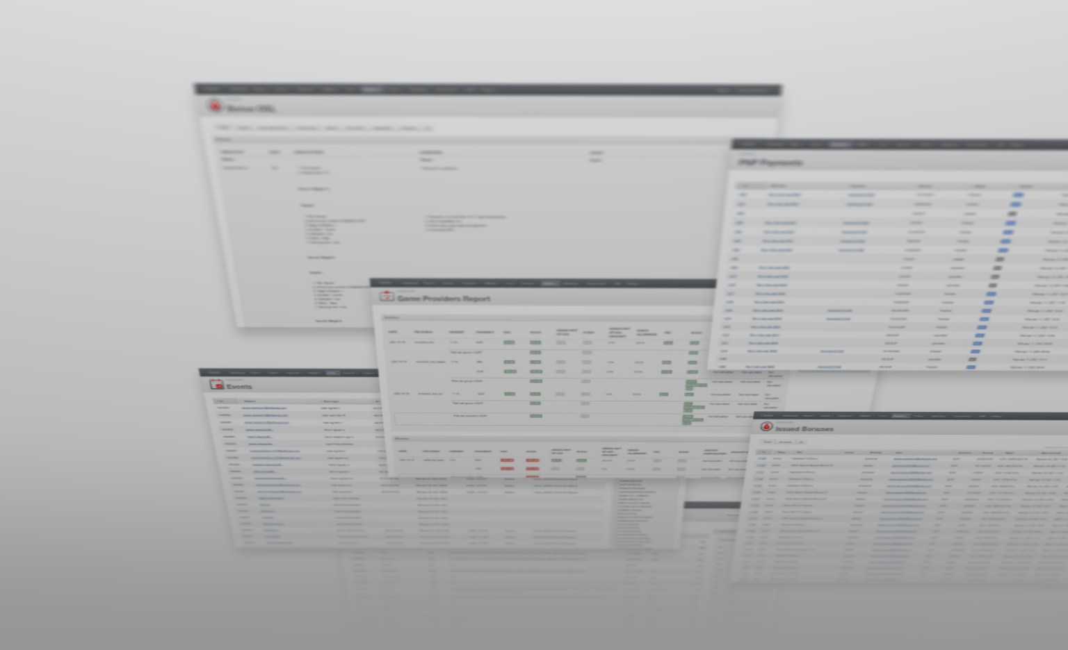
The original dashboard was cluttered and difficult to navigate, with inconsistent UI patterns and overwhelming data displays causing friction for regular users.
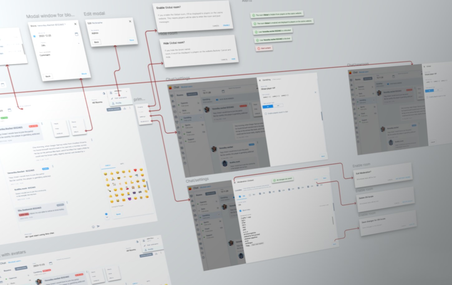
We conducted user research and created low-fidelity wireframes to test new information architecture and navigation patterns early in the process.
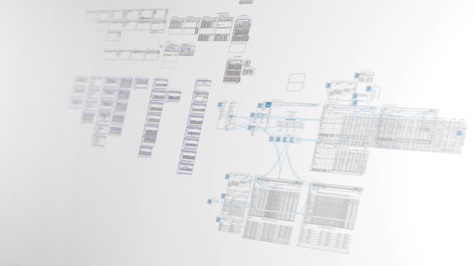
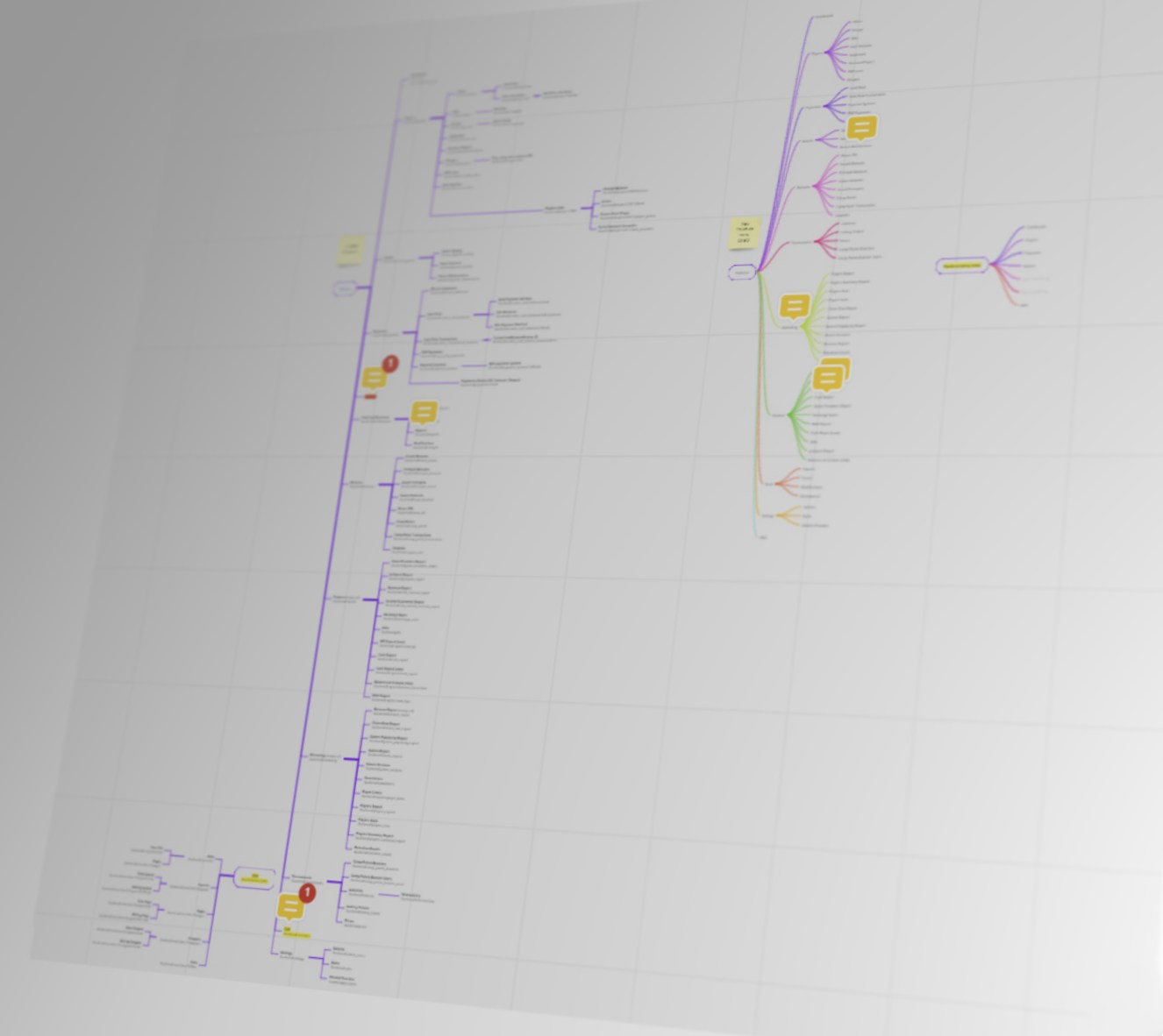
To build a strong foundation, we completely overhauled the platform's information architecture and designed a comprehensive sitemap, clearly defining content hierarchy and reducing cognitive load.
The redesigned dashboard features a clean, modern interface with improved data visualization, intuitive navigation, and personalized user experiences.